Tuesday, May 23, 2006

Farmhouse Model - part 6


More Farmhouse madness - still plenty of work to do but its defintly coming together I think.

Tuesday, May 16, 2006

Farmhouse Model - part 5


Hello all, here is a tad more development on the farmhouse. We toyed with having wooden tiles on the roof but it just wasn't working. I think this looks a lot better.

We've done some more development on the script, its been slow going due to other work commitments but I think we are getting there. We are also still negotiating over voice talent.

Friday, May 12, 2006

Farmhouse Model - part 4


These two images are the same farm model as yesterday, just seen from some different angles. I think the model is getting a lot of character now and throwing up more opportunities and questions at every turn! That’s the fun part of the creative process.
The farm house was difficult to explore in the original comic strips so this modelling process is defining a lot of grey areas. Gordon is going to do some interior drawings very soon; we will post them here when they are done. (No pressure Gordon!)

This model is being built by Gerard Hunt here at Qurios. He's currently texturing the roof area; I'll post some more images next week to let you all see how it’s coming on. As always comments and suggestions are always very welcome.

Have a good weekend!

Friday, May 05, 2006

Farmhouse Model - part 1

We have just started work on a 3D model of the farmhouse. A low-poly version was built years ago as part of development of a game based the original comic strips. This new version will be a much more detailed affair.

Tuesday, May 02, 2006

Colourification!

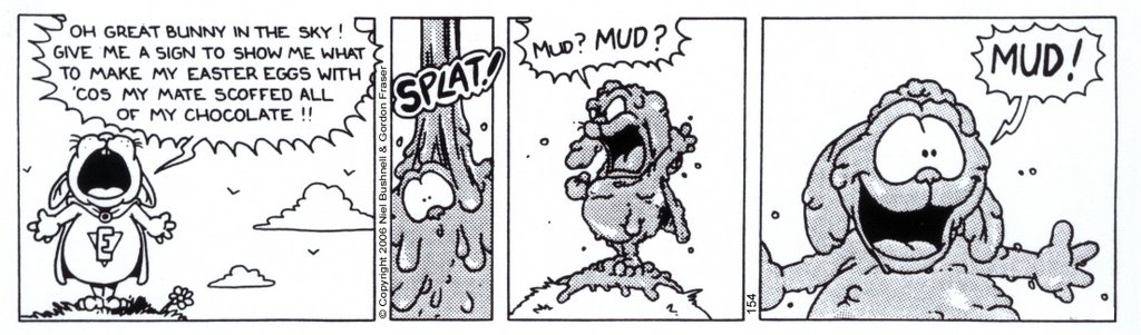
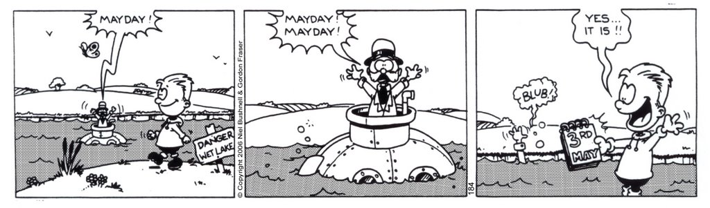
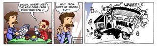
Gordon’s post yesterday got me thinking about some colour tests I did a while ago. As Gordon mentioned the hardest part of colouring up an image that wasn't originally intended to be colour is dealing with the blacks and the letratoned areas. Rather than remove the letratone I decided to colour it so that it still worked as a tone value for the underlying colour. I approached this in a very similar way to colouring a 2D animation cell. (About 10 years ago I worked in a 2D studio and it was gradually moving from hand painted cells to digital colouring. Hand painting was a fascinating process but too forever!!) I coloured up some of the original line work so it wasn't all a uniform black. Here is the original strip, this was one of a series of about 5 strips that ran over Easter and saw Dalton having to deliver Easter eggs without a supply of chocolate!
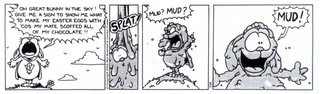
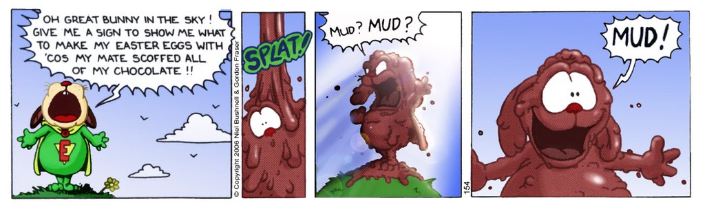
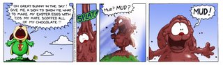
And here is the coloured version. I deliberately hyped up the sky as Dalton is supposed to be having one of those revelation moments!

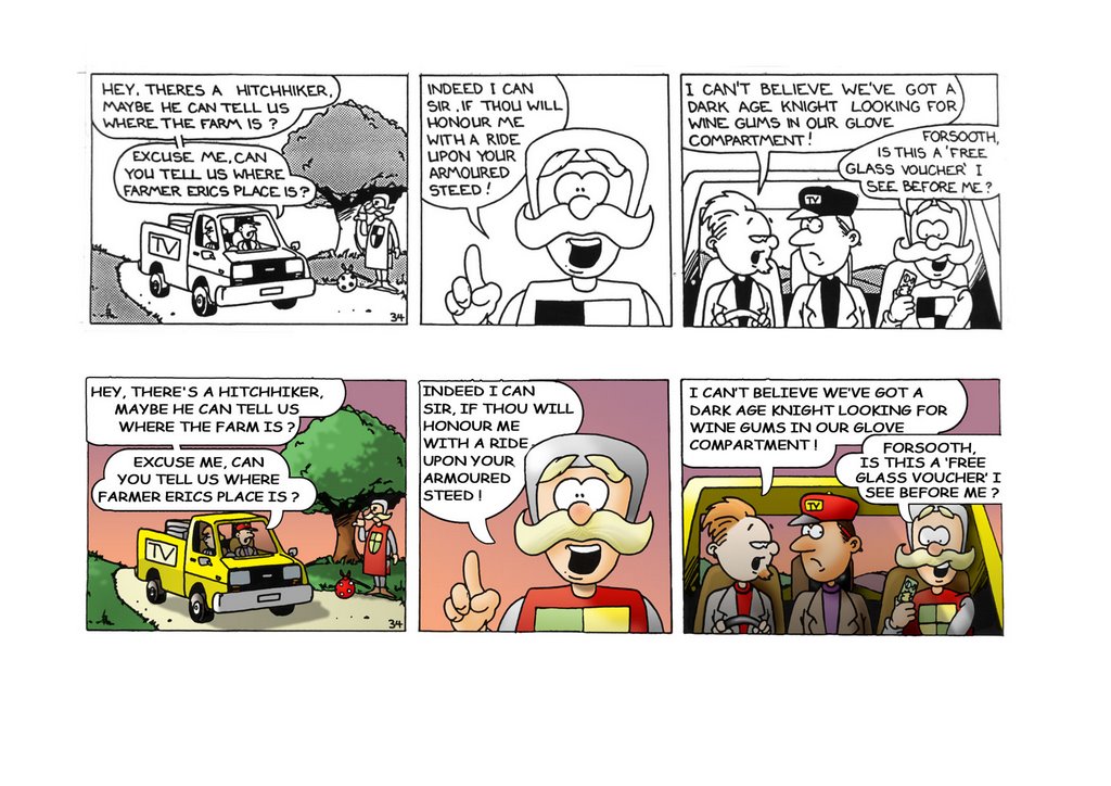
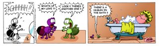
Next up are two strips that have been partially coloured. This was to show publishers the difference between black & white and colour versions of the strips.


These two strips have had the lettering replaced with a comic font. I personally prefer the hand lettering but the strips are full of spelling errors. I plan on creating a font from the hand written letters and use that to give the strips consistency, clarity and correct the spellings.
Thanks to Gordon for posting over the last few weeks, it’s been a busy time here but hopefully as things get back to normality I'll be posting more.

Niel

Monday, May 01, 2006

The Dark Ages.....


I haven't got many more of my old colour work from the Farm left to show and because of my last posts cock-up (cheers Glazy!) as a punishment I set myself the challenge of colouring in one of the original strips. Niel and myself have been toying with the idea of cleaning up the original print run and adding colour to them all so I thought I'd try one out.

Obviously, it was a black and white strip to start with. We'd both write the scripts together, then I'd do all the pencils and Niel would ink them and add the lettering. (A role which was reversed for the 'Flasher Mac' strip) In the glorious days before god's holy gift of Adobe PS we had to rely on pencils, paper, ink and the height of technical achievements...Letratone. This stuff provided all the uniform dots you see to add a subtle tone to a black and white image. At the time it came in two flavours, a sheet of transfers, where you just pressed it directly onto your illustration (this was more expensive and beyond our meagre budget!) and the cheapo version which was basically an A3 sheet of sellotape with dots on. Niel would have to cut out the basic shape he was looking for, stick it onto the strip, then with a scalpel, trim it to fit. I always thought that Niel was an inking god but he pulled off some excellent work on the Farm!

Anyway, back to the colouring, I'd forgotten about the letratone, so now in Photoshop I've had to erase any of the tone work Niel did all those years ago. There was quite a lot of solid blacks as well, so I've removed them to make more room for some colour. I re-did the lettering and balloons, although again I've got to say, that Niels lettering was pretty damned good. I'm quite pleased with the end result but I've got a feeling that Niel will come back with his legendary line when we work together.....'MORE DETAIL!'